Cards
.card
    .card-header Basic Card Example
.card-body This is an example of a basic card.Note: The card styling in SB Admin Pro looks best with a light background color due to the background color of the card header, card body, and box shadow.
Card with Dropdown in Header:
This is an example of a custom card with a dropdown action inside of the card header. The card's overflow is set to hidden, so your card body height should exceed the height of your dropdown menu.
.card.card-header-actions
    .card-header
        | Header Dropdown
        .dropdown.no-caret
            button#dropdownMenuButton.btn.btn-transparent-dark.btn-icon.dropdown-toggle(type='button', data-bs-toggle='dropdown', aria-haspopup='true', aria-expanded='false')
                i.text-primary(data-feather='more-vertical')
            .dropdown-menu.dropdown-menu-end.animated--fade-in-up(aria-labelledby='dropdownMenuButton')
                a.dropdown-item(href='#!') Action
                a.dropdown-item(href='#!') Another action
                a.dropdown-item(href='#!') Something else here

    .card-body
| ....card-header-actions
class to your
.card
when using two elements within the card header. This class will apply flex styling to the card header, allowing for even spacing between the text and another element.
Card with Icons in Header:
This is an example of a custom card with a group of icons inside of the card header.
.card.card-header-actions
    .card-header
        | Header Icons
        div
            button.btn.btn-pink.btn-icon.me-2
                i(data-feather='heart')
            button.btn.btn-teal.btn-icon.me-2
                i(data-feather='bookmark')
            button.btn.btn-blue.btn-icon
                i(data-feather='share')

    .card-body
....card-header-actions
class.
Card with a Button in Header:
This is an example of a custom card with a button inside of the card header.
.card.card-header-actions
    .card-header
        | Header Button
        button.btn.btn-primary.btn-sm Action

    .card-body
| ....btn-sm
styling. The
.btn-xs
styling is also supported, but larger buttons may change the internal height of the card header.
Card with an Input in Header:
This is an example of a custom card with a form input inside of the card header.
.card.card-header-actions
    .card-header
        | Header Input
        form
            input.form-control(placeholder='Search')

    .card-body
....card-header-actions
class in order to position the card header elements correctly.
This is a collapsable card example using Bootstrap's built in collapse functionality with some added custom styling. Click on the card header to see the card body collapse and expand!
.card.card-collapsable
    a.card-header(href='#collapseCardExample', data-bs-toggle='collapse', role='button', aria-expanded='true', aria-controls='collapseCardExample')
        | Collapsable Card Example
        .card-collapsable-arrow
            i.fas.fa-chevron-down
    #collapseCardExample.collapse.show
        .card-body
| ...Lorem ipsum dolor sit amet, consectetur adipisicing elit, sed do eiusmod tempor incididunt ut labore et dolore magna aliqua. Ut enim ad minim veniam, quis nostrud exercitation ullamco laboris nisi ut aliquip ex ea commodo consequat. Duis aute irure dolor in reprehenderit in voluptate velit esse cillum dolore eu fugiat nulla pariatur. Excepteur sint occaecat cupidatat non proident, sunt in culpa qui officia deserunt mollit anim id est laborum.
Lorem ipsum dolor sit amet, consectetur adipisicing elit, sed do eiusmod tempor incididunt ut labore et dolore magna aliqua. Ut enim ad minim veniam, quis nostrud exercitation ullamco laboris nisi ut aliquip ex ea commodo consequat. Duis aute irure dolor in reprehenderit in voluptate velit esse cillum dolore eu fugiat nulla pariatur. Excepteur sint occaecat cupidatat non proident, sunt in culpa qui officia deserunt mollit anim id est laborum.
.card.card-scrollable
    .card-header Scrollable Card Example
    .card-body
        p.card-text
            ...
.card-footer.small.text-muted Card Footer.card-body
element, and scroll the contents of the card body when the height is fixed. You can set the max height of the card body by changing the
$card-scrollable-max-height
SCSS variable, which is set to
15rem
by default. You can also set the max height of the card body using inline CSS, or CSS overrides for different cards.
Card Image Caps:

Card Image Cap (Top)
This is am example of a default Bootstrap image card with an image above the card body content.
Card Image Cap (Bottom)
This is am example of a default Bootstrap image card with an image below the card body content.
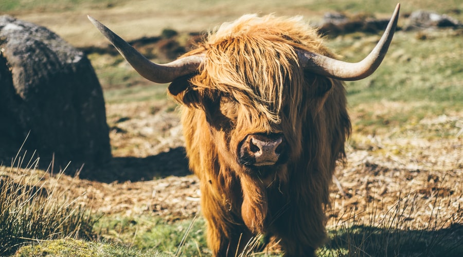
//- Card Image Cap (Top) Example
.card
    img.card-img-top(src='path/to/image', alt='...')
    .card-body
        h5.card-title Card Image Cap (Top)
        p.card-text
            | ...

//- Card Image Cap (Bottom) Example
.card
    .card-body
        h5.card-title Card Image Cap (Bottom)
        p.card-text
            | ...
    img.card-img-bottom(src='path/to/image', alt='...')
Card Image Overlay:
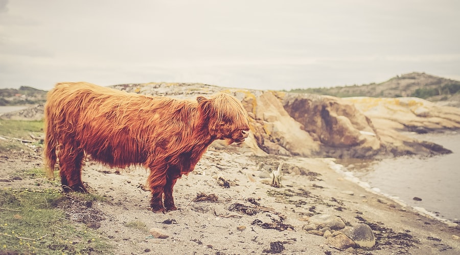
//- Card Image Overlay Example
.card
    img.card-img(src='path/to/image', alt='...')
    .card-img-overlay
        h5.card-title Card Image (Overlay)
        p.card-text
| ...Card Image Sides:
Card Image (Left)
Use the Bootstrap grid with utility classes to create this card variant.
Card Image (Right)
Use the Bootstrap grid with utility classes to create this card variant.
//- Card Image (Left)
.card
    .row.g-0
        .col-md-4
            img.img-fluid(src='path/to/image', alt='...')
        .col-md-8
            .card-body
                h5.card-title Card Image (Left)
                p.card-text
                    | ...

//- Card Image (Right)
.card
    .row.g-0
        .col-md-8
            .card-body
                h5.card-title Card Image (Right)
                p.card-text
                    | ...
        .col-md-4
img.img-fluid(src='path/to/image', alt='...')Waves:
.card-waves
to set the background image to the waved styling. This works best with default white cards, and with cards that do not have a card footer.
//- Waves Styled Card
.card.card-waves
    .card-header Waves Card Example
.card-body ...Angles:
.card-angles
to set the background image to the angled styling. This works best with default white cards, and with cards that do not have a card footer.
//- Angles Styled Card
.card.card-angles
    .card-header Angles Card Example
.card-body ...//- Icon Card Example
.card.card-icon
.row.g-0
.col-auto.card-icon-aside.bg-primary
i.me-1.text-white-50(data-feather='layers')
.col
.card-body.py-5
h5.card-title Custom Icon Card
p.card-text
| ...Default Card Colors:
Here is some example text within the card body.
Here is some example text within the card body.
Here is some example text within the card body.
Here is some example text within the card body.
Here is some example text within the card body.
Here is some example text within the card body.
Here is some example text within the card body.
//- Primary Card
.card.bg-primary.text-white
    .card-header.text-white Primary Card
    .card-body
        p.card-text ...
    .card-footer Card Footer

//- Secondary Card
.card.bg-secondary.text-white
    .card-header.text-white Secondary Card
    .card-body
        p.card-text ...
    .card-footer Card Footer

//- Success Card
.card.bg-success.text-white
    .card-header.text-white Success Card
    .card-body
        p.card-text ...
    .card-footer Card Footer

//- Danger Card
.card.bg-danger.text-white
    .card-header.text-white Danger Card
    .card-body
        p.card-text ...
    .card-footer Card Footer

//- Warning Card
.card.bg-warning.text-white
    .card-header.text-white Warning Card
    .card-body
        p.card-text ...
    .card-footer Card Footer

//- Light Card
.card.bg-light
    .card-header.text-dark Light Card
    .card-body
        p.card-text ...
    .card-footer Card Footer

//- Dark Card
.card.bg-dark.text-white
    .card-header.text-white Dark Card
    .card-body
        p.card-text ...
.card-footer Card Footer.bg-*
background utility class, along with a text color utility class when necessary. All of the above examples, except for the light background colored card, use the
.text-white
utility along with a background utility.
Extended Card Colors:
Here is some example text within the card body.
Here is some example text within the card body.
Here is some example text within the card body.
Here is some example text within the card body.
Here is some example text within the card body.
Here is some example text within the card body.
Here is some example text within the card body.
Here is some example text within the card body.
Here is some example text within the card body.
Here is some example text within the card body.
//- Red Card
.card.bg-red.text-white
    .card-header.text-white Red Card
    .card-body
        p.card-text ...
    .card-footer Card Footer

//- Orange Card
.card.bg-orange.text-white
    .card-header.text-white Orange Card
    .card-body
        p.card-text ...
    .card-footer Card Footer

//- Yellow Card
.card.bg-yellow.text-white
    .card-header.text-white Yellow Card
    .card-body
        p.card-text ...
    .card-footer Card Footer

//- Green Card
.card.bg-green.text-white
    .card-header.text-white Green Card
    .card-body
        p.card-text ...
    .card-footer Card Footer

//- Teal Card
.card.bg-teal.text-white
    .card-header.text-white Teal Card
    .card-body
        p.card-text ...
    .card-footer Card Footer

//- Cyan Card
.card.bg-cyan.text-white
    .card-header.text-white Cyan Card
    .card-body
        p.card-text ...
    .card-footer Card Footer

//- Blue Card
.card.bg-blue.text-white
    .card-header.text-white Blue Card
    .card-body
        p.card-text ...
    .card-footer Card Footer

//- Indigo Card
.card.bg-indigo.text-white
    .card-header.text-white Indigo Card
    .card-body
        p.card-text ...
    .card-footer Card Footer

//- Purple Card
.card.bg-purple.text-white
    .card-header.text-white Purple Card
    .card-body
        p.card-text ...
    .card-footer Card Footer

//- Pink Card
.card.bg-pink.text-white
    .card-header.text-white Pink Card
    .card-body
        p.card-text ...
.card-footer Card Footer PUG
PUG